
The non-profit organization nyendo.lernen UG (nyendo learning) enables school students in Germany, Austria, and Switzerland to entrepreneurially bring to life social projects. Their returns fund impactful initiatives at partner schools in Nairobi, Kenya, such as establishing social infrastructure and education programs for children and youths. In the process, the participating students themselves learn to act impactfully and economically at an international scale and realize their potential. To ensure the appeal to this young generation between 12-18 years, their schools, teachers as well as donors, it was time for a rebranding.
Social Entrepreneurship — Rebranding of an NGO
Consequently, we’ve come up with an identity framework in the marketing team which I have then realized as the brand design concept you’ll find here. The goal for the new appearance: replacing the existing logo (not scalable enough on digital channels) with a modern wordmark and favicon that work in all applications — from website and social media to print materials. The previous branding should still be referenced to allow recognizability but be refreshed considerably.
Services provided:
Branding
Graphic design
Logo Development
As part of the rebranding process, a new logo with a matching favicon was to be created. After discussing different mood boards, we’ve agreed to step away from the previous logo and go for a modern wordmark. Below, you’ll see three of the logo drafts that made it into the final selection.
“Nyendo” means movement in Suaheli. Thus, the logo needed to include a form of motion, flow, or dynamic, too.
Objectives for the new wordmark:
Clear, fresh, and personable.
Expresses movement, cohesion, respect, and zest for life.
Works digitally (different screen sizes) and on print.
Appealing to school students, teaching staff, and donors.
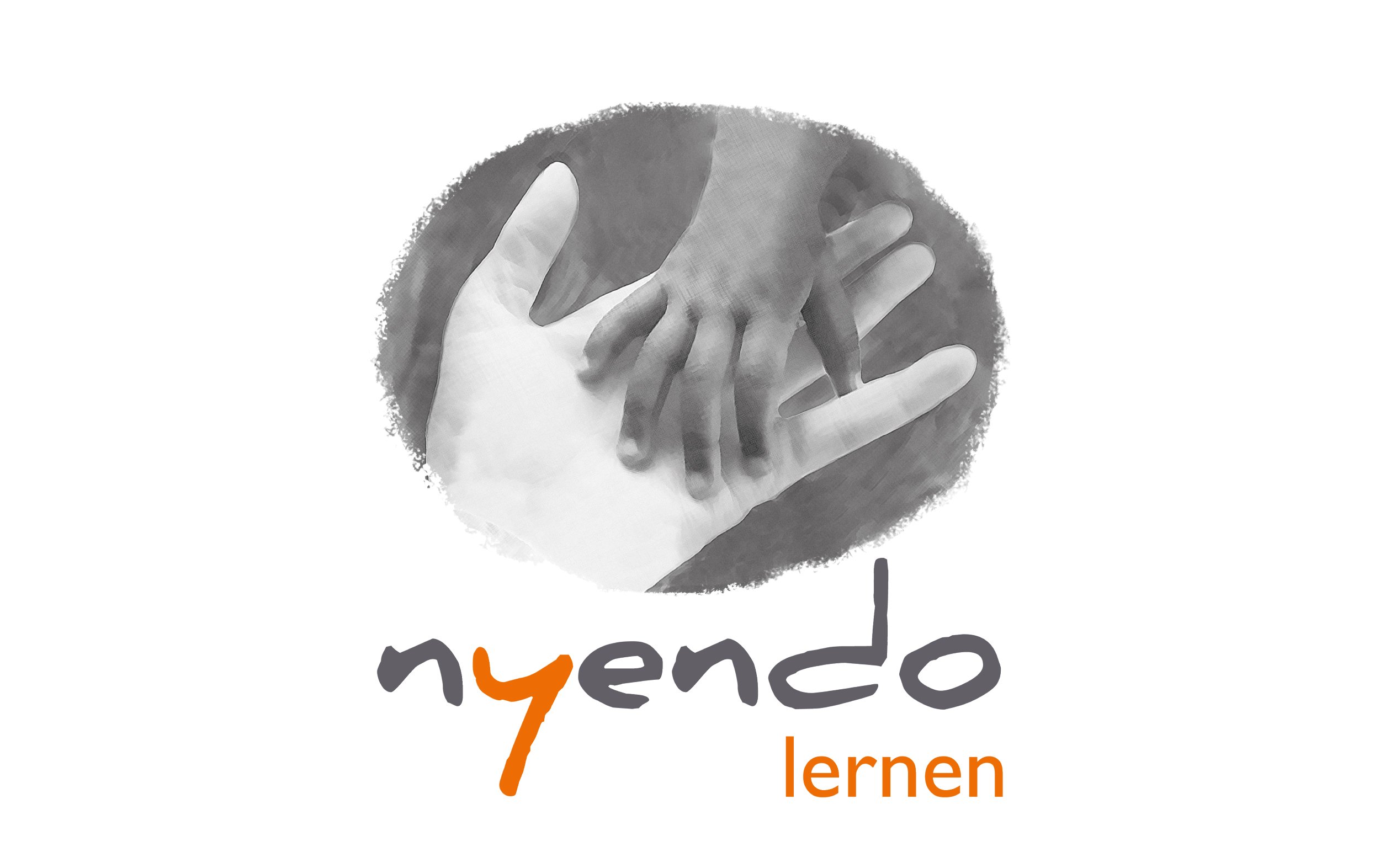
Previous logo

Draft A — favicon & logo

Draft B — favicon & logo

Draft C — favicon & logo
Animation of the new logo

New logo and favicon
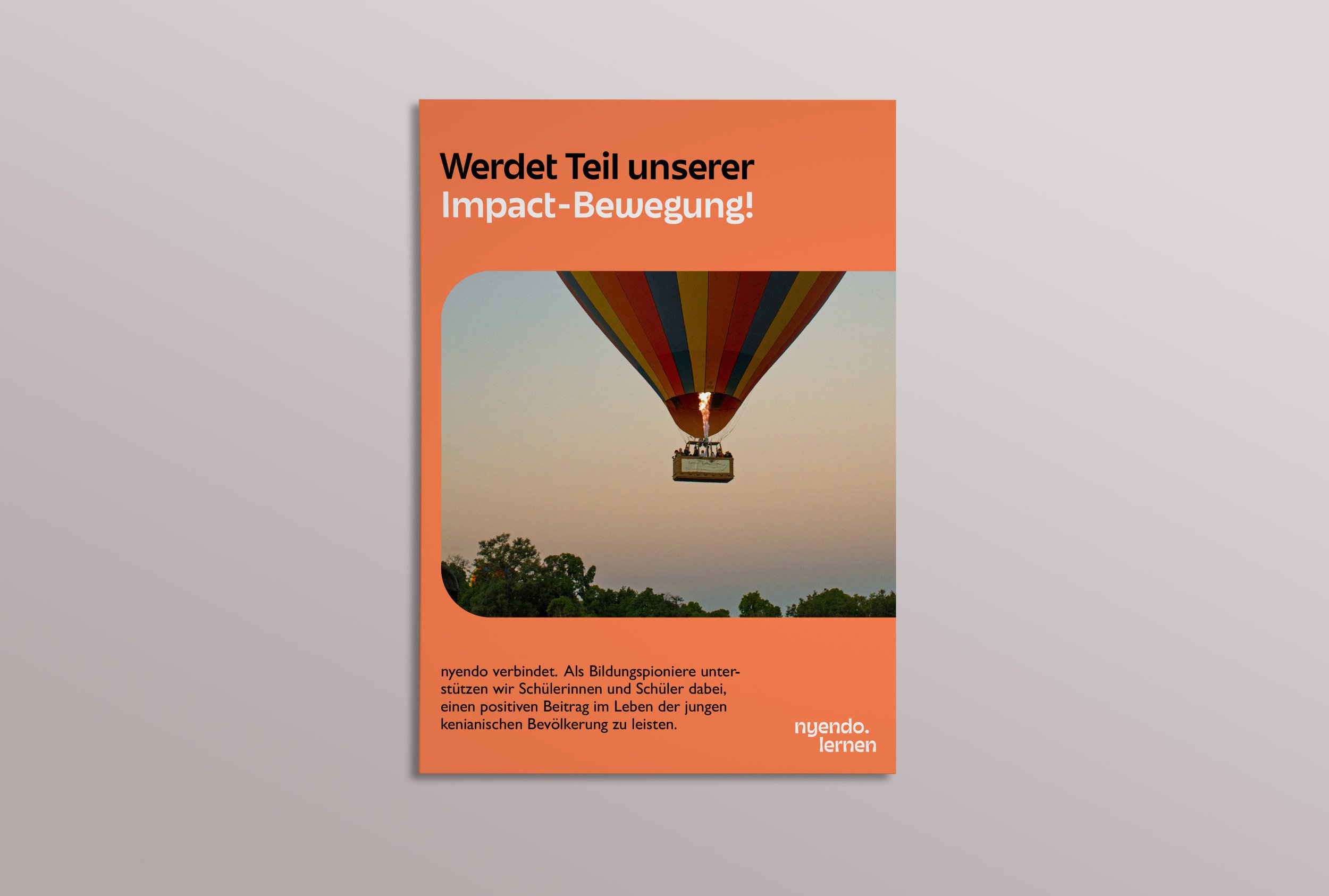
Applications


Colors
To allow people to trace the old brand in the new one, we wanted to ensure certain recognizability. That’s why I gave the nyendo colors a fresh paint and added a few complementary hues.
They represent vitality, hope, and the connection to Kenya. By having a broader spectrum of colors to draw from and a few subtler shades, e.g. for backgrounds, it becomes easier to design brand materials with variety.

Previous brand colors

New brand colors
Typography
In addition to the typeface already in use for running text, a new typeface with a lively character is adding shine to written words. It reflects the logo’s personable look while remaining clear enough.

Typeface for headlines
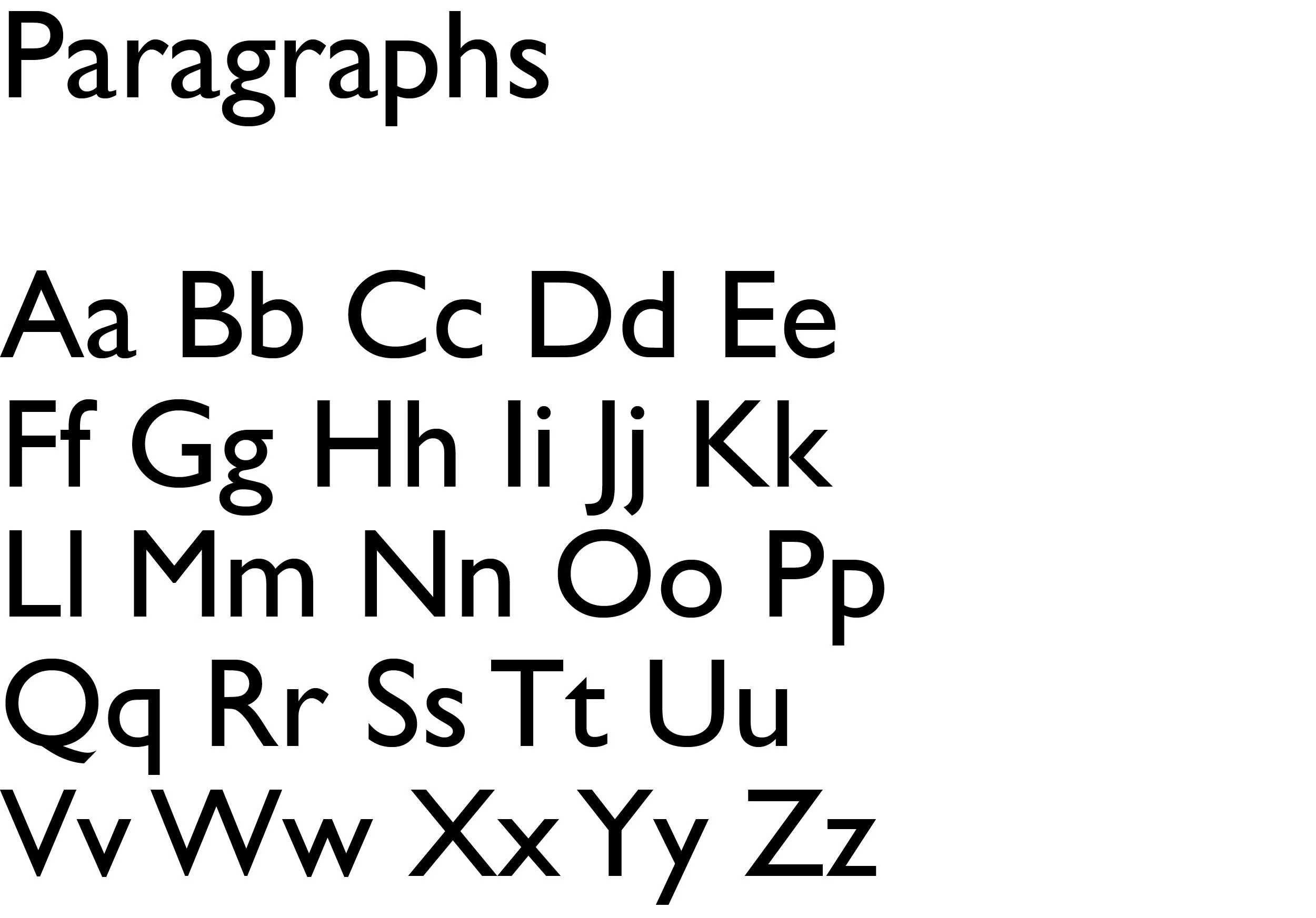
Typeface for paragraphs
Sticker mockup: Image by rawpixel.com on Freepik,
sticker-design by Isabella Kattner