
Shining Service —
Amore on the Roads
The company CARIAMO was born as a passion project. Its founder and CEO loves to spread the feeling of having a brand-new car. He offers interior cleaning and care for vehicles so that, even after years of use, they can shine like on their first day.
He assigned me to increase the visibility of his newly-launched services with design, including with suitable icons for the website and a poster for partner companies. While the logo existed already, I’ve expanded the intended fresh and modern look.
Services provided:
Graphic Design
Illustration


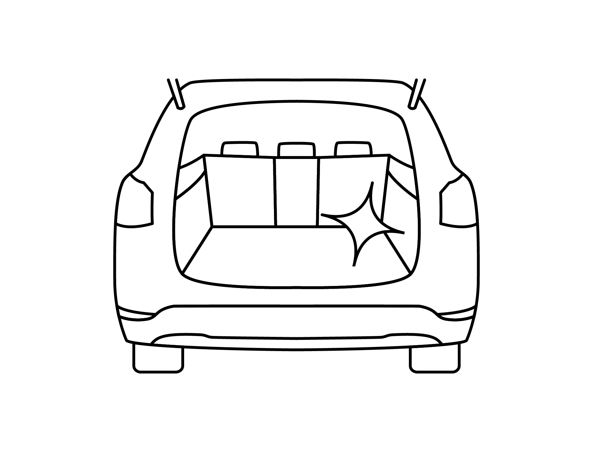
The CARIAMO services are divided into three categories: Comfort, Professional and Individual. The first two are offered for different types of vehicles: roadster, coupé/limousine, station wagon (“Kombi”)/SUV, van/mini bus. My task was to create icons for them, plus an additional icon for the “Individual” services in general and one for the car trunk specifically.
I also developed a corresponding concept for a web layout, showing how the services, including duration and fee, can be presented on the website in a clear and modern way (see below).
Scroll of the web concept for the service page of CARIAMO, including categories
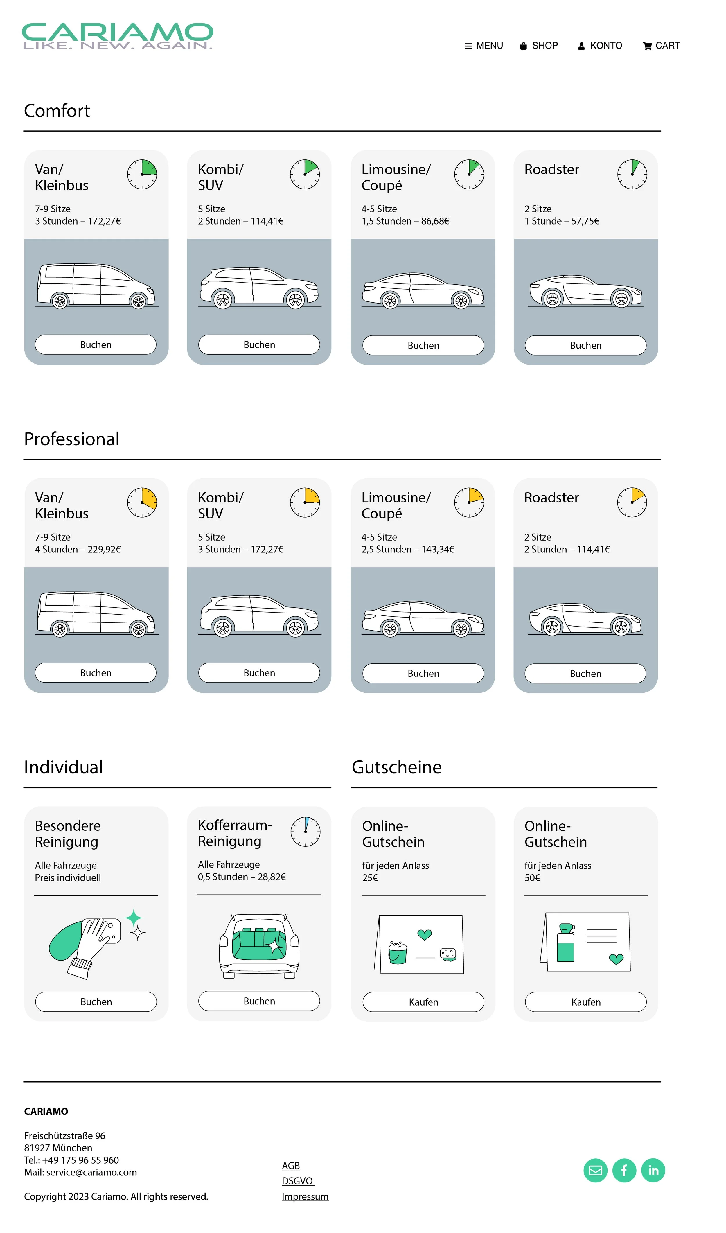
Web concept in full view

More variations of the “car cards”
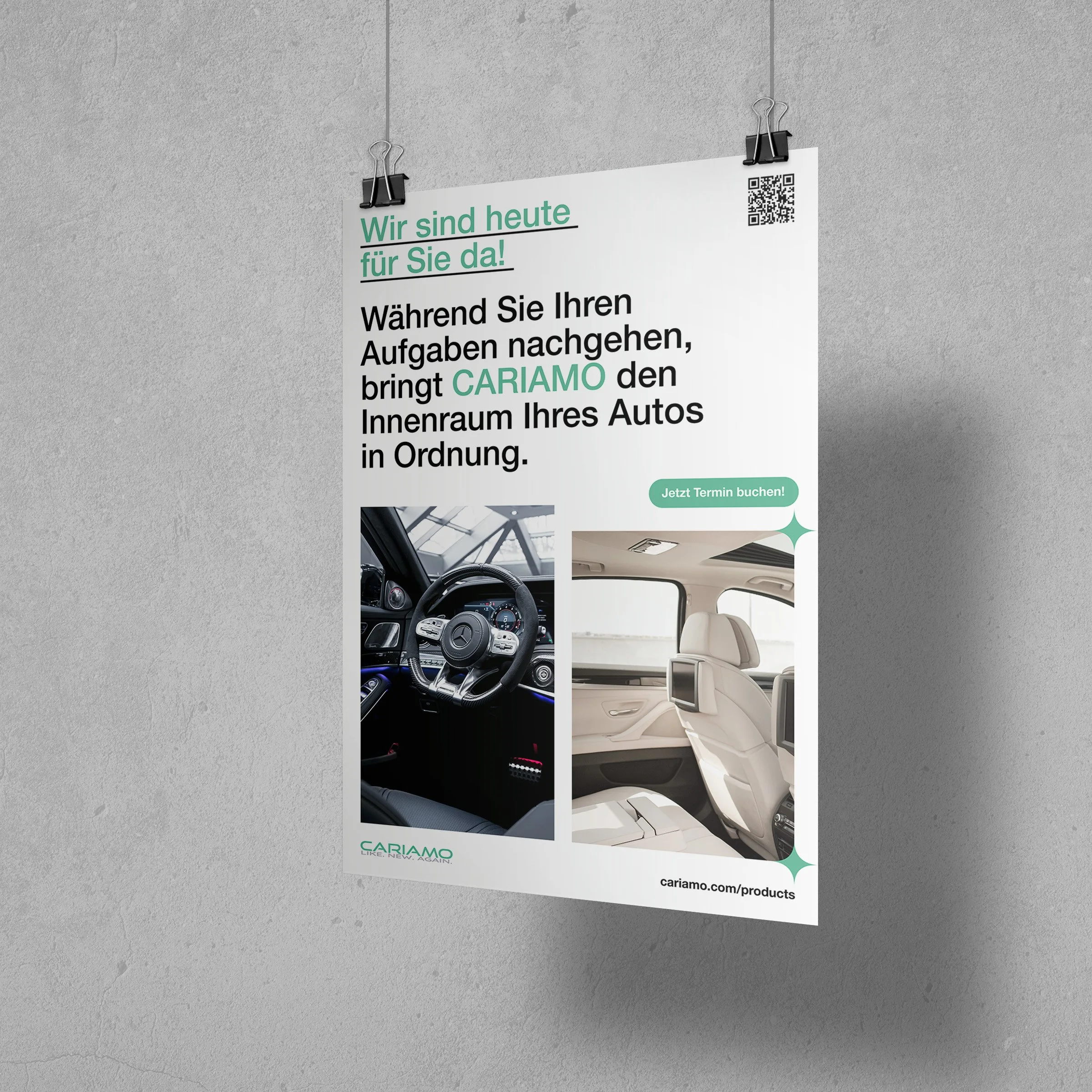
Part of the marketing materials are posters. The first one is seen at partner companies with tennis facilities where CARIAMO offers interior cleaning services for vehicles. The second poster can be displayed in different places as a timeless version and is especially intended for office buildings. There, employees and business people can have their cars cleaned during their work time.
It was vital for me to condense information as much as possible to not weaken the posters’ impact with a large amount of text. Together with CARIAMO’s CEO, I’ve summarized the most important copy. Everything else is to be explained when the user is on his/her journey on the website (while booking) which they can reach via the QR code or the URL.

Poster 1 in Din A1 format
Poster 2 in Din A1 format
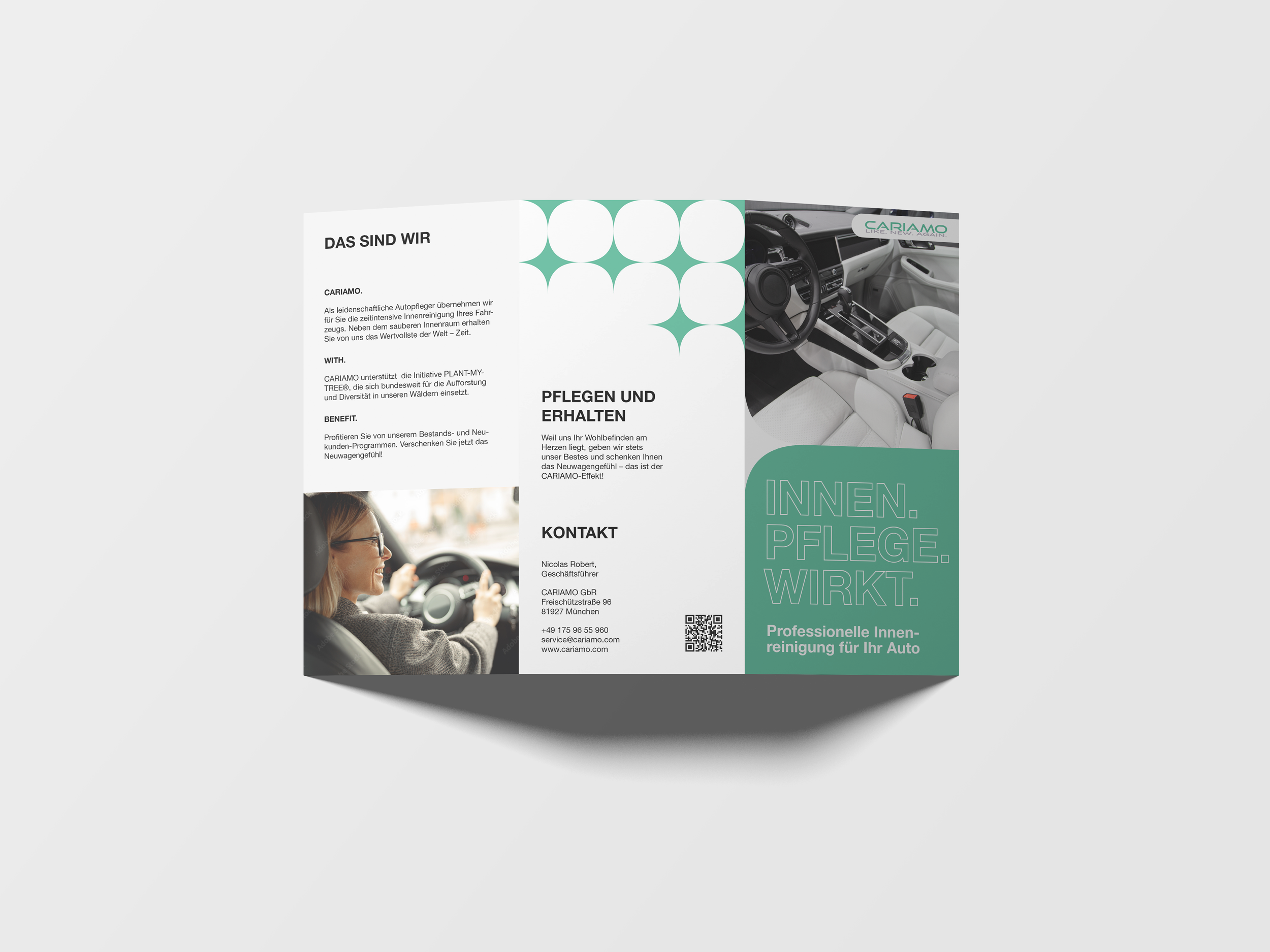
Eventually, the CEO wanted to advertise CARIAMO through leaflets, too. With the proposed copy text, I’ve done research on suitable formats and created the layout. In it, the brand’s design palette shines through again — with color accents in turquoise and modern illustrative elements, for example. High-quality stock photos visualize the service’s promise and value while suiting the industry and target group and supplementing the modern clear look.
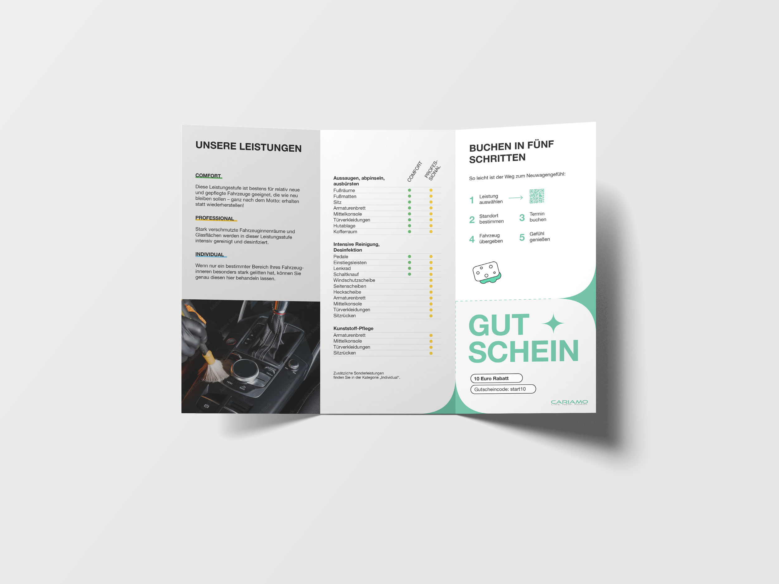
A voucher (“Gutschein”) allows customers to save money in the booking process. I’ve included it as an element that can be cut out and is spatially efficient — still, it is an eye-catcher thanks to its bold typography. A service overview (“Unsere Leistungen”) and according checklist show which cleaning is provided in which package, differentiated by the defined color code for CARIAMO’s services. To increase the impact of its overall message, I’ve recommended slight adjustments to the headings and copy which helped unclutter the leaflet.
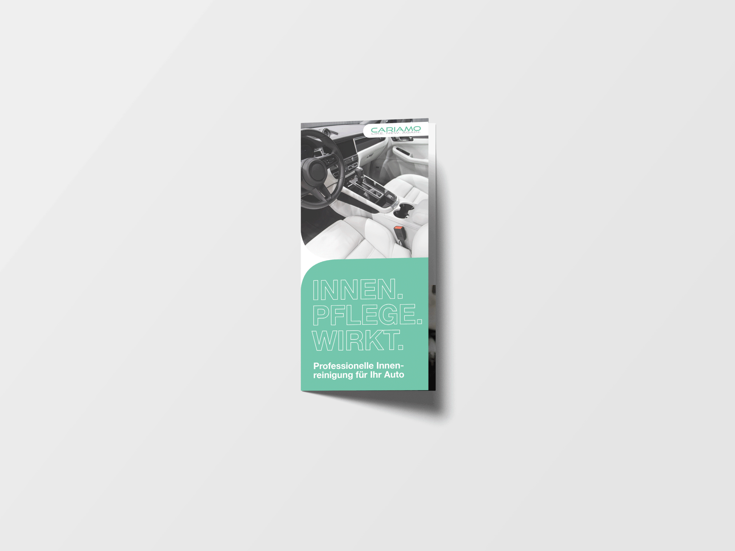
Leaflet in Din A6 long format

The main brand color is fresh turquoise. I’ve augmented the color palette in agreement with CARIAMO to give each service category its own hue — shining as brightly as the main one. The whole palette is in line with a modern brand and fits the attributes clean, fresh, and positive.
Images:
Photo background website layout (video) — Erik Eastman
Poster mockup: Image by rawpixel.com on Freepik
Leaflet mockup: Image by Yeven Popov on Freepik